I used to think charm bracelets were just silver or gold. Pick a metal and find charms in that finish. Color didn’t enter the equation beyond metal choice.
Then I discovered enamel charms, gemstone accents, and colored metal finishes. Suddenly charm bracelets could incorporate actual color palettes instead of just metallic tones.
This opened up completely new styling possibilities. My bracelets could coordinate with outfits, reflect seasonal changes, or express moods through color choices. Way more interesting than plain silver chains.
Learning to use color intentionally transformed my charm collection from basic jewelry into actual fashion accessories.
Monochromatic Blue Schemes
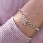
Blue charms create calm, cohesive bracelets that coordinate with denim and navy clothing. I built an entire bracelet in various blue shades and it’s become my most-worn piece.
Light blue enamel charms mix with navy stones and pale aqua accents. All blues, but different saturations create depth instead of flatness. Silver metal ties everything together without competing.
Blue topaz or aquamarine crystals add sparkle in blue tones. Small accent stones between enamel charms catch light and elevate the whole composition.
This color scheme works year-round but feels especially appropriate for summer and coastal themes. Beach charms in blue tones create obvious thematic coherence.
The monochromatic approach makes coordination easy. Everything’s blue, so nothing clashes. You’re choosing shade variations rather than worrying about color combinations.
Warm Autumn Palette
Rust, copper, bronze, and deep gold create rich warm bracelets perfect for fall and winter. These colors feel cozy and sophisticated against darker seasonal clothing.
Rose gold and copper charms form the base. Add enamel pieces in burnt orange, deep red, and chocolate brown. The warm metals and earth-toned enamel create harvest-season perfection.
Amber or cognac-colored crystals add warm sparkle. Garnet stones provide deep red accents. Tiger’s eye beads introduce striped brown and gold patterns.
This palette coordinates beautifully with autumn wardrobes full of burgundy, brown, camel, and olive. The bracelet becomes a seasonal signature piece.
Transition into winter by adding darker pieces – deep burgundy and chocolate brown. Remove brighter oranges and coppers for richer, more subdued warmth.
Rainbow Bright Collection
Some people embrace full spectrum color in their charm bracelets. Every color represented, creating vibrant joyful jewelry that makes a statement.
This approach requires careful balance to avoid looking like a kid’s toy. Use mostly silver charms with small color accents rather than massive enamel pieces in every color.
Space colors evenly around the bracelet. Don’t cluster all reds together and all blues together – distribute rainbow colors for even visual flow.
Limit each color to one or two charms maximum. Too many of any single color disrupts the rainbow effect. The goal is balanced spectrum, not dominance of specific hues.
Clear crystals between colored charms provide visual breathing room. Prevents color overload and adds sparkle without contributing additional hue.
Pastel Spring Palette
Soft pinks, mint greens, pale yellows, and lavenders create delicate spring-appropriate bracelets. These colors feel fresh and feminine without being overly sweet.
Pair pastels with silver or white gold rather than yellow gold. The cool metals complement soft colors better than warm gold tones.
Small enamel flowers in pastel shades mix with pale gemstones. Rose quartz for soft pink, light amethyst for lavender, peridot for pale green. Gemstones add dimension beyond flat enamel color.
This palette transitions from spring into summer by adding slightly brighter versions of the same colors. The base remains soft and pretty while gaining intensity.
Personalized charms in silver work beautifully with pastel palettes. The metallic finish provides structure against the soft colors without overwhelming them.
Classic Black And White
Stark black and white creates sophisticated modern bracelets that work with minimalist wardrobes. This scheme feels intentionally stylish rather than accidentally assembled.
Black enamel charms mix with silver pieces and white stones. Onyx beads add solid black. Clear or white crystals provide bright contrast.
This palette coordinates with everything. Black and white is universally flattering and matches any outfit without thinking about it.
The high contrast creates drama that softer palettes can’t achieve. Black and white together demands attention in ways single colors don’t.
Add tiny pops of metallic – gold or rose gold – to warm the stark palette slightly. Prevents the combination from feeling too cold or harsh.
Wrapping This Up
Color transforms charm bracelets from simple metal jewelry into expressive fashion accessories. Intentional palettes create cohesion and style that random charm collections never achieve.
Choose colors that complement your wardrobe and personal coloring. Warm skin tones favor warm palettes, cool skin tones prefer cool colors. Work with your natural coloring instead of against it.
Seasonal color rotation keeps bracelets feeling current. Swap out a few charms to shift from spring pastels to autumn warmth without rebuilding entire bracelets.
Start with one focused color palette and master it before attempting complex multi-color schemes. Monochromatic or two-color combinations are easier to execute successfully than rainbow approaches.
Let color choices reflect your mood and style evolution. Your charm bracelet can adapt as your preferences change, creating jewelry that grows with you rather than becoming outdated.

Previous Article
How To Pick Charms For Custom Charm BraceletsNext Article
Guide To Caring For Custom Charm Bracelets